Dark mode has transformed from a nostalgic throwback to an essential UI/UX design standard that greatly influences overall User Experience. Once limited to early computer terminals with glowing text on black screens, it has re-emerged as a mainstream expectation for modern digital products. Users now demand the option to switch seamlessly between light and dark interfaces, and designers must deliver experiences that prioritize readability, accessibility, and comfort for an enhanced User Experience.
Dark mode actually dates back to the very early days of computing, despite the fact that it may appear to be a more recent trend. Some of the first computers had amber or green text on black screens by default.
As technology advanced, light mode quickly became the standard, with contemporary interfaces that mimicked white paper.
Dark mode is currently very much in vogue again, but it’s not just a fashion statement. For improved accessibility and, in certain situations, user comfort, dark mode design can be essential in user experience.
But what is dark mode exactly? Furthermore, how can designers make sure they’re doing it correctly?
Think of this as your go-to manual for dark mode design, complete with practical advice, industry best practices, and real-world examples.
What is the design of dark mode?
Light mode and dark mode are typically the options available when using an app, website, or device such as a laptop or smartphone.
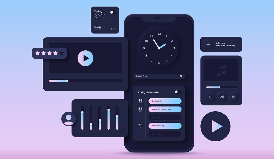
With most digital interfaces, light mode is the default setting and usually consists of darker text on a lighter background. In contrast, dark mode makes use of lighter-colored text and user interface elements on a darker background color.
Consider the New York Times Games web application as an example. The app shows in light mode by default, but users can quickly switch to dark mode in the settings menu.
Designing user interfaces with dark mode optimization is known as “dark mode design.”
Contrast, readability, accessibility, and overall aesthetic appeal are all important considerations when designing for dark mode, but more on that later.
Let’s start by talking about the advantages of dark mode and its rising popularity.
Why create for dark mode? (The primary advantages)
Dark mode is popular among designers and users for reasons other than just its sleek and contemporary appearance. Dark mode can greatly enhance the user experience when applied appropriately.
Dark mode can assist with:
- Reduce the user’s eye strain: Dark mode offers a softer, more gentle viewing experience because it emits less light than its brighter, more glaring counterpart, light mode. In addition to being more comfortable overall, many users find that this lessens eye strain.
- Cut down on screen glare in poorly lit areas: You understand how painful the sudden brightness can be if you’ve ever woken up in the middle of the night and reached for your phone without first dimming the screen. Dark mode makes low light conditions much more comfortable by reducing the stark contrast between the screen and the surrounding darkness.
- Make things more accessible: Dark mode may enhance contrast and readability for users who are visually impaired. On the other hand, dark mode might be more accessible and comfortable for users who are light-sensitive.
These are the advantages, but what about possible disadvantages? Does using dark mode make sense in certain situations? Let’s examine.
When to avoid using dark mode (possible disadvantages)
Dark mode might not be the best design option in some circumstances. Keep the following restrictions in mind if you’re thinking about using dark mode design for your upcoming project:
- Dark mode may increase eye strain in bright settings: Dark mode is hard to see in bright spaces. Light mode is better for visibility in sunlight or well-lit rooms.
- Dark mode isn’t ideal for content-heavy applications: Dark mode may make the interface difficult to read if it contains lengthy text blocks. Font size, style, and low contrast can make dark mode especially hard to read.
- Dark mode can hinder accessibility for visually impaired: Dark mode may make the product less accessible and pleasurable for users with low vision or specific forms of color blindness.
It’s crucial to weigh the advantages of dark mode design against any potential disadvantages. Giving users the option to switch between light and dark mode based on the situation, surroundings, and their own requirements and preferences is ideal.
Check this out: Designing for Color Blindness: Creating Truly Inclusive User Experiences
Best practices and practical advice for designing for dark mode
Now that we understand dark mode and how it affects the user experience, let’s move on to the more useful task of designing for dark mode.
1. Avoid pure colors
A pure white text on a pure black background may be your first idea when you begin designing for dark mode. Pure colors like these, however, produce an excessive amount of contrast, which can seriously strain the user’s eyes.
Think about using off-white text (like #DBDBDB) and dark grey for the background (like #070707).
Choose subdued hues for any primary and secondary colors in your color scheme.
Using a desaturated, more subdued shade of pink for dark mode (like #D56283) is preferable if your color scheme typically includes vibrant pink (like #F7007B). For buttons and other UI highlights, this would be perfect.
2. Make sure there is enough contrast
Ensure strong contrast between background, text, and UI elements. Good contrast is vital for both readability and accessibility.
WCAG recommends a 4.5:1 contrast ratio for normal text. For larger text (18pt or 14pt bold), the minimum is 3:1. Use the WCAG Color Contrast Checker tool to see how different color combinations contrast with one another.
3. Reduce the saturation level
Bright, saturated colors are best avoided in dark mode design, even though they look fantastic in light mode. When contrasted with a dark background, highly saturated colors can look excessively intense and startling. They will also make it difficult to read text.
Reducing saturation doesn’t mean using dull colors. It means softening hues for a more unified, visually pleasing dark interface.
For instance, if you’re using a bright blue in light mode (like #0072EB), you may want to use a more muted shade for dark mode (like #3379BE).

4. Use highlights and gradients instead of shadows
To add depth and direct the user’s attention to particular elements, you can apply shadows to a variety of elements in light mode. This isn’t as effective in dark mode, though, as shadows will hardly show up against a dark background.
Instead, experiment with subtle gradients or highlights. For instance, if you have a call-to-action button, you may want to make sure it stands out and attracts the user’s attention by adding a lighter colored border.
Another choice is to give each element a subtle outer glow. As a result, they will seem to be slightly illuminated.
Applying an outer shadow to your selected element in a color that goes well with its primary color will accomplish this. For instance, you might use a softer shade of the same blue for the outer glow if your button is blue.
5. Make all text as readable as possible
You must carefully style all of the text because it can make or ruin your dark mode design.
First and foremost, pick your text color carefully. Lighter hues, like light grey or off-white, are ideal for body text. Avoid using pure white as we previously discussed because it can appear too harsh on a dark background. You can use a bit brighter color for headings. This aids in establishing a distinct visual hierarchy that directs the user to crucial information.
Finally, experiment with line spacing and font sizes to maximize readability and clarity.
6. Offer a toggle so that users can alternate between light and dark modes
We discussed the advantages of dark mode as well as some possible disadvantages earlier in this guide. Ultimately, light mode is better in some situations and dark mode makes sense in others.
Allow users to adjust their preferences with a single click by including a straightforward toggle in the settings menu or right within the interface.
This adaptability guarantees that customers will get the most out of your product whether they are using it in a brightly lit room or in direct sunlight.
7. Examine your user interface in various settings and devices
Make sure your dark mode design works as intended in various scenarios before developing and launching it. Make sure your user interface is consistent across tablets, laptops, desktop computers, and mobile devices by testing it on a range of screens and sizes.
Simultaneously observe the performance of your dark mode design under various lighting scenarios. Experiment with it in direct sunlight, dim interior lighting, and total darkness.
Final words
Dark mode is more than a visual trend-it’s a functional design choice that can improve accessibility, reduce eye strain, and enhance user comfort. However, it also comes with challenges, especially in bright environments or content-heavy layouts. By balancing readability, contrast, and user control, designers can create dark mode experiences that are both practical and visually appealing across all devices and conditions.
Ready to elevate your User Experience? Start designing dark mode interfaces that balance style, accessibility, and comfort today. At InCreativeWeb, we specialize in creating modern, user-focused web designs that seamlessly integrate light and dark modes. Our approach ensures every website delivers superior User Experience, combining accessibility, style, and functionality across all devices. Get in touch with us today and let’s craft a website that blends innovation, dark mode excellence, and outstanding User Experience.
FAQs
1. What is dark mode design?
Dark mode design is the process of creating interfaces with light text and UI elements on a dark background, optimized for readability and usability.
2. Why is dark mode popular?
It reduces eye strain in low-light environments, saves battery on OLED screens, and provides a modern, sleek look.
3. Does dark mode save battery life?
Yes, on OLED and AMOLED screens, dark mode can save energy because dark pixels use less power.
4. When should dark mode be avoided?
Avoid dark mode in bright or outdoor settings and in content-heavy apps, where readability might suffer.
5. How can designers ensure accessibility in dark mode?
By maintaining proper color contrast (WCAG guidelines), avoiding pure colors, and testing with visually impaired users.
6. Should apps always include a dark mode option?
Yes, offering a toggle between light and dark modes ensures flexibility and improves the user experience.
7. What tools help check dark mode contrast?
Tools like the WCAG Color Contrast Checker or Stark plugin for Figma and Sketch help verify accessibility compliance.
Author
Jayesh Patel
Jayesh Patel is a Professional Web Developer & Designer and the Founder of InCreativeWeb.
As a highly Creative Web/Graphic/UI Designer - Front End / PHP / WordPress / Shopify Developer, with 14+ years of experience, he also provide complete solution from SEO to Digital Marketing. The passion he has for his work, his dedication, and ability to make quick, decisive decisions set him apart from the rest.
His first priority is to create a website with Complete SEO + Speed Up + WordPress Security Code of standards.