In the fast-evolving digital landscape of 2025, Cumulative Layout Shift (CLS) is no longer a metric confined to the developer’s console-it’s a core pillar of user experience, credibility, and conversion. As a performance signal deeply woven into Google’s Core Web Vitals, CLS demands as much attention from designers as it does from developers. At our agency, we champion a CLS-first design methodology, placing layout stability at the heart of every interface decision.
What Is CLS and Why Designers Are Now Responsible
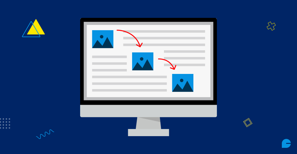
CLS quantifies unexpected movement of elements on a webpage-those irritating jumps and shifts that occur when images, fonts, ads, or other components load asynchronously. While developers traditionally received the blame, the root cause often lies in flawed design patterns.
Visual instability is no longer a back-end oversight. It’s a front-line design issue. Whether it’s unreserved image space, improper font handling, or injected pop-ups, CLS reflects how resilient your design is under real-world conditions.
The Cost of High CLS: Beyond SEO Penalties
A high CLS score is a UX killer. It contributes to:
- Involuntary clicks and rage taps
- Form abandonment and decreased conversions
- Increased bounce rates
- Loss of user trust and credibility
A layout that jumps during loading creates cognitive friction. It undermines the trust users subconsciously place in a site’s stability. And when your visitors only give you a few seconds to prove your value, that trust is everything.
The Designer’s Role in CLS: From Pixels to Performance
We, as designers, control the layout, hierarchy, and behavioral rhythm of every user interaction. CLS is a reflection of whether those elements remain consistent as content loads. Here’s how design directly influences layout stability:
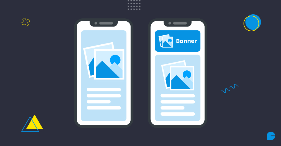
1. Hero Images Without Reserved Space
A full-width banner with no defined aspect-ratio or placeholder space results in massive page shifts when the image finally loads. Always use:
aspect-ratio: 16 / 9;
or a defined height block in your layout framework.
2. Font Loading and Fallback Planning
Custom fonts enhance branding-but if they aren’t preloaded or font-display optimized, users experience a shift when the final font replaces the fallback. Use:
font-display: swap;
and align fallback font metrics with custom fonts in the design phase.
3. Third-Party Content and Widgets
Ads, embeds, iframes, and social media integrations are often the biggest disruptors of layout integrity. Allocate static heights and reserve containers during the wireframing stage.
4. Sticky Headers, Announcement Bars, and CTAs
Floating components appearing late in the render cycle can cause sudden displacements. Reserve their space upfront and ensure your CSS handles them predictably.
Also read: Supercharging Website Performance and Speed with Artificial Intelligence
CLS and Mobile UX: The Hidden Danger
On mobile, the effects of poor CLS are magnified:
- Tap targets shift mid-action, leading to erroneous clicks
- Form misfires result in frustration
- Screen real estate is limited, meaning layout shifts often affect critical content
Mobile-first design must be CLS-aware by default. Our approach includes simulating 3G loading speeds and underpowered Android devices during design reviews to stress-test layout stability.
Implementing a CLS-Conscious Design System
Design systems in 2025 should embed CLS principles at their core. Here’s how we structure our own component libraries:
Each component in our system:
- Reserves space before content loads
- Uses aspect-ratio containers
- Includes loading placeholders
- Has documented fallback behavior
Best Practices to Prevent High CLS
- Use CSS Aspect Ratios: Modern CSS allows for
aspect-ratio, eliminating the need for JS hacks or spacer divs.
- Always Include Loading Skeletons: Design with placeholders to prevent jarring layout changes. Skeleton UIs provide rhythm and expectation.
- Preload Critical Assets: Fonts, logos, and hero images should be preloaded to reduce shift on initial render.
- Reserve Space for Ads and Widgets: Never let third-party content inject unpredictably. Assign static heights or placeholders.
- Collaborate Early with Developers: Design should not be handed off in a vacuum. Pair designers with front-end engineers to build resilient prototypes together.
Creating Trust Through Visual Stability
A low CLS score signals a predictable, controlled, and trustworthy user interface. As digital experiences become more complex and personalized, predictability is usability. Even the most beautiful interface fails if its elements move unexpectedly.
Design must evolve from static mockups to performance-aware systems. We embed stability thinking directly into our Figma libraries, check CLS metrics during prototype testing, and iterate based on real-world performance-not ideal conditions.
Conclusion
Designing with CLS in mind means building for the real web-not just what looks good on your machine. In 2025, CLS is the new frontier of user experience ownership for designers.
Every decision you make, from layout rhythm to image loading and fallback strategy, contributes to a user’s perception of reliability and polish. A shifting layout is a broken promise. InCreativeWeb help brands build digital experiences that stay solid-under every network, on every device, for every user.
Take the Next Step Toward CLS Excellence
Whether you’re redesigning a site or refining your design system, we’re here to guide you through a CLS-first approach. Let’s eliminate layout shifts and build interfaces that are both beautiful and bulletproof.
Get in touch with our UX specialists to audit your design system for CLS readiness.
FAQs
1. What is Cumulative Layout Shift (CLS) and why does it matter in 2025?
CLS measures unexpected layout shifts on a web page while it’s loading. In 2025, it’s a critical user experience and SEO metric, directly affecting engagement, trust, and rankings in Google’s Core Web Vitals.
2. Why should designers care about CLS instead of just developers?
Designers control layout hierarchy, image spacing, font use, and UI components-all of which impact CLS. Visual instability often stems from design decisions, making it a shared responsibility.
3. How does high CLS impact user experience and conversions?
High CLS can cause users to misclick, abandon forms, or bounce from a page. It creates cognitive friction and undermines trust, especially on mobile where space is limited and shifts are more disruptive.
4. What are the most common design mistakes that increase CLS?
Common culprits include hero images without aspect ratios, unoptimized font loading, third-party widgets without reserved space, and floating headers that push content unexpectedly.
5. How can a design system help reduce CLS?
CLS-conscious design systems include predefined aspect ratios, safe zones for dynamic content, skeleton loaders, and fallback font strategies-ensuring visual consistency during content load.
6. What are some best practices designers can follow to prevent layout shifts?
Use CSS aspect ratios, preload critical assets like fonts and hero images, include skeleton loaders, and collaborate early with developers to stress-test design in real-world loading scenarios.
Author
Jayesh Patel
Jayesh Patel is a Professional Web Developer & Designer and the Founder of InCreativeWeb.
As a highly Creative Web/Graphic/UI Designer - Front End / PHP / WordPress / Shopify Developer, with 14+ years of experience, he also provide complete solution from SEO to Digital Marketing. The passion he has for his work, his dedication, and ability to make quick, decisive decisions set him apart from the rest.
His first priority is to create a website with Complete SEO + Speed Up + WordPress Security Code of standards.