Given that the technological know-how necessary to generate these designs is significantly less difficult than that of other design aspects, icon design is frequently regarded to be straightforward. Effective icon design takes into consideration factors such as size, perspective, simplicity, messaging, and integration with the branding or product design in addition to just how appealing the icon itself looks.
The various operations, features, and functionalities in a digital product are represented by icons, which are brief graphic symbols. When used correctly, the icon may make the entire product experience and comprehension smooth, which is essential in today’s hyper-digital environment.
Top 7 Fundamentals of Icon Design
Designing icons that are both aesthetically pleasing and meaningful requires designers to abide by certain rules. In accordance with these principles, icons should follow certain rules about their design, size, color, and form, as well as the overall user interface.
1. Clarity in Icon Design
Clarity is the first golden guideline you should concentrate on when designing an excellent icon. The user’s impression of your symbol and the inferences they will make from it are discussed in Clarity.
Icon design must be carefully considered from the user’s point of view because icons are used to represent visual cues and aid users in effectively navigating a product, application, or interface.
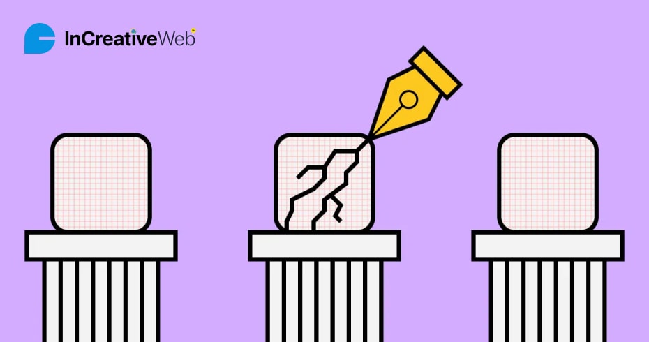
An illustration of clarity
Clarity, for instance, ensures that the icon delivers the message to everybody who looks at it and is immediately clear to them.
The symbol is most frequently linked with the starting period, therefore it is excellent to utilize in this circumstance. As a designer, you could be tempted to go beyond the obvious.
2. Readability in Icon Design
Readability is the second icon design guiding concept. The user’s capacity to quickly comprehend and interpret a symbol is referred to as readability, which is a crucial component in icon design. An icon that can be read is one that is uncomplicated, straightforward, and easy to grasp.
Simple, uncomplicated shapes that aren’t overly complex or cluttered should be used for the basic elements of logo design, such as the geometric shapes and icon typeface.
As a result, the user can explore the website with ease and discover what they’re looking for despite the fact that there are many different parts on the same page.
An illustration of readability components
The icon will be more readable and understandable if simple shapes and clean lines are used in its design. Make sure the icon stands out and adheres to design elements of the proper colors and tints for the best legibility, just like you would with typography.
3. Alignment
The third icon design tenet, alignment, emphasizes how each icon’s positioning is essential for a high-quality result.
All of the user interface’s design elements, including the icons, should be in line with one another. This means that the icon needs to be aligned with other elements, like text or buttons, and positioned in a constant spot.
How to get perfect alignment
An essential component of icon design that contributes to the creation of a unified and well-organized layout and facilitates user interface navigation is proper alignment.
When designing icons, employing grid-based layouts to ensure uniformity is a simple technique to assure accurate alignment. To establish a sense of order and balance, this entails placing icons apart with a fixed distance and aligning them according to a grid.
Users will find it simpler to browse the interface with the help of proper alignment, which contributes to the creation of a unified and well-organized layout.
4. Brevity
The fourth icon design rule, brevity, describes the simplicity and minimalism of a symbol’s elements.
Icons ought to be succinct and direct. This means that the icon should be created in a way that is as clear-cut and straightforward as possible to communicate a specific message or idea. The icon will be easier for consumers to remember and comprehend if it has a straightforward, straightforward style.
Examples of Shortness & Detail
We may examine the color scheme and the way icon designers must think when making an icon in the design shown above. A complicated or heavy design should be avoided because most icons are meant to be used on small canvases where it is more difficult for the user to understand what is going on.
Also read: Most Practical Tools You Need for Front-End Development
5. Consistency
Consistency, the fifth icon design principle, relates to the consistency of design throughout icon families rather than the duplication of an icon design.
To maintain consistency in icon design, make sure that each icon follows the same guidelines for size, shape, color patterns, shadows, alignments, and general appearance.
This can involve adding new rounded-corner icons to an existing icon set, such a rounded rectangle, or reviewing the icon set, stroke weight, and other factors that designers employ to ensure consistency.
Examples of consistency
Even though the example’s icons have different colors and icon types, they all have shadows with identical patterns and sizes that blend in seamlessly.
6. Personality
The sixth principle discusses the character or distinctive branding of the icons. A digital product can stand out and become more memorable for users by using icons with personalities.
This can be accomplished by inserting distinctive characteristics, such as a particular style or subject, into the icon design. Common icon sets and premium icon sets are distinguished by their personalities.
The user experience can be substantially improved and a digital product can be made more entertaining and memorable for users by incorporating personality into icon design.
A example of smart branding or personality
The CRED app serves as an excellent illustration of how to employ symbols that have personality and brand requirements.
7. Ease of Use
The final design tenet addresses usability and simplicity. The guiding principle in icon design is “less is more.” The easier it is to use icon sets in a product or application, the fewer components and simplicity they have.
The user experience can be significantly enhanced with intuitive icons. This indicates that the icon needs to be simple and self-explanatory in design.
Example of User-Friendly
The icons for a music streaming service are a fantastic illustration of this because they are simple yet effectively convey the idea without the use of additional text.
Each indicator has an easily recognizable, straightforward design that makes it plain to the user where they are and how to go to their desired location.
Conclusion
Knowing what an icon will be used for and where it will be placed is essential before you begin designing it. You will be better able to design user-friendly icons by considering the experience from their point of view.
Furthermore, keep in mind that these 7 icon design ideas are only broad principles to aid in the development of your craft. How effectively you comprehend the requirement and follow these technical guidelines to determine the final product every time.
Author
Jayesh Patel
Jayesh Patel is a Professional Web Developer & Designer and the Founder of InCreativeWeb.
As a highly Creative Web/Graphic/UI Designer - Front End / PHP / WordPress / Shopify Developer, with 14+ years of experience, he also provide complete solution from SEO to Digital Marketing. The passion he has for his work, his dedication, and ability to make quick, decisive decisions set him apart from the rest.
His first priority is to create a website with Complete SEO + Speed Up + WordPress Security Code of standards.