An Introduction to Web Design Typography
Typography is the art and practice of organizing typefaces so that written text is readable, readable, and presentable. In addition to improving content readability and understanding, well-chosen typography communicates the personality and brand character of the website.
The Evolution of History
Typography has a long history that began when people began writing down information in ancient civilizations. It has changed continuously from the time of ancient inscriptions and manuscripts until Johannes Gutenberg’s development of moveable type in the fifteenth century.
For the most part, creative web designers were limited to employing a few number of web-safe typefaces to guarantee uniformity across all platforms and devices. Frequently, this restriction led to visually boring and uninspired webpages.
The focus on typography grew beyond aesthetics as web design techniques developed further. Designers started carefully employing typography to evoke particular emotions, communicate hierarchy, and direct user attention after realizing the psychological impact of fonts on user experience.
Typography’s Function in Web Design
The use of typography in web design is a potent tool with many applications beyond aesthetics.
1. User Experience and Communication
Web design is fundamentally about communicating. A website’s typography has a big influence on how well that communication happens. Selecting the appropriate font styles, sizes, and spacing can significantly improve the content’s readability and understanding, making it easier for visitors to take in information.
The user experience is improved by clear and readable font since it reduces the mental strain needed to explore and comprehend the website’s information.
Typography contributes not only to legibility but also to a website’s voice and tone. Effective user engagement and a lasting impression can be achieved by designers by matching typography to the website’s goal and target audience.
2. Creating a Personal Brand
A powerful tool for establishing recognition and brand building is typography. It is easier for people to locate what they need when designers combine contrast and different typographic components to produce a layout that is clear and easy to scan.
The constant employment of specific typefaces throughout a variety of brand touchpoints, including the website, logo, marketing collateral, and social media, promotes visual harmony and brand unity. Particularly effective in establishing a unique brand identity are custom typefaces or fonts with distinctive styling.
3. Visual Organization and Readability
Establishing visual hierarchy through typography is essential for conveying to consumers the relative importance of various website elements. Key information, headlines, and subheadings can be highlighted with the careful application of font sizes, weights, and styles.
A consistent and enjoyable user experience requires that content be readable on all platforms, including desktops and mobile phones. Users can discover what they need more readily when designers combine contrast and different typographic components to create a layout that is easy to scan.
Important Typographic Principles for Web Design
Understanding the fundamentals of typography is crucial for web designers to produce visually appealing, intuitive, and intriguing digital experiences.
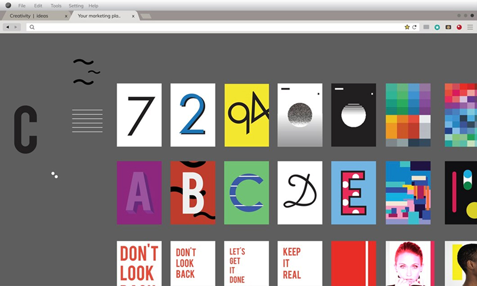
1. Selection of Typefaces
1.1. Serif vs. Sans-serif
One of the most important typographic choices for web design is whether to use serif or sans-serif typefaces. Sans-serif fonts look cleaner and more contemporary because they don’t have the tiny decorative lines, or “serifs,” that serif fonts feature at the ends of their characters.
Serif fonts are ideal for projecting an impression of authority or refinement because they are frequently connected to tradition, formality, and elegance. Sans-serif typefaces, on the other hand, are popular for websites that strive to be modern and user-friendly since they give off a more approachable and modern vibe.
1.2. Display vs. Body Fonts
The difference between display and body typefaces must be carefully considered by web designers. Display typefaces are perfect for headlines, banners, and other design elements that require emphasis because they are usually more ornamental, imaginative, and eye-catching.
Conversely, body fonts are chosen for their capacity to be readable and legible in lengthier text passages. The main option for paragraphs and content-heavy portions of a website, they should be readable even at lower sizes.
1.3. Web-safe Fonts and Custom Fonts
Historically, web designers could only use a few number of web-safe typefaces to guarantee uniform display on different screens. However, thanks to the development of web technologies, designers can now employ bespoke fonts through the use of embedding techniques such as @font-face.
More creative freedom and brand customisation are possible with custom typefaces. However, to guarantee a seamless user experience, designers should exercise caution when selecting unique typefaces that preserve high readability and load quickly.
2. Line spacing and font size
A website’s readability and user experience are greatly impacted by font size and line spacing. It is generally advised to use a font size of 16 to 18 pixels for body text in order to guarantee comfortable reading on a variety of devices. Larger font sizes can be used in headings and subheadings to create visual hierarchy and direct readers through the material.
3. Color and Contrast
To keep text easily readable, typography uses contrast, which is the separation of font color from backdrop. Additionally, color can be purposefully employed to elicit feelings and transmit information. Designers should, however, use moderation and refrain from employing too many colors or colored writing that could make it difficult to read.
4. Justification and Alignment
A website’s readability and general appearance are influenced by the text’s alignment. For body content, left-aligned text is most frequently used since it offers a clear and simple structure. Long paragraphs might not work as well with center-aligned text, but it can work well with some design features.
Text aligned to the left and right margins, or justified, can provide an image of formality and polish. But it can also result in a lack of regularity in the distance between words, which could make it harder to read, particularly on small displays or in narrow columns.
Responsive Typography
A key element of this design methodology is responsive typography, which guarantees that text on a website fluidly adjusts to different screen sizes and resolutions.
1. The Value of Adaptability
The idea of responsive typography is to make reading on any device as comfortable as possible. An inadequate user experience and possible user disengagement can arise from material that is either too small to read on smaller devices or excessively large on larger displays due to a failure to address responsive typography.
2. Media Inquiries for Fonts
A key component of responsive web design is media queries, which let designers adjust for the features of the user’s device. To adapt to different devices, designers can use media queries to define precise font sizes, line heights, and even transition between different typefaces.
3. Techniques for Dynamic Typography
Instead of using fixed pixel values, fluid typography creates adjustable font sizes dependent on the viewport size. This method makes it possible for text to adjust fluidly when users switch between devices with different screen widths or resize their browser window.
When web designers combine media queries with fluid typography approaches, they can create responsive and adaptive type that guarantees the best possible reading experience on all devices.
Read more: Why Accessibility in Web Design Matters: A Complete Guide
Web Design Typography Best Practices
There are best practices that site designers should follow in order to maximize this important design feature.
1. Effects on Various User Populations
Typography is essential to improving a website’s usability for people with different requirements and abilities. It directly affects people who browse the web on different devices, have cognitive problems, or are visually impaired.
2. Providing Readability for Every User
In order to guarantee that typography is usable by everyone, designers want to concentrate on components that improve readability.
A good contrast between the background and the text is essential. Because light gray text on white backgrounds and dark text on dark backgrounds might be difficult to read, particularly for users with impaired vision or contrast sensitivity, designers should steer clear of these pairings.
3. Guidelines for Accessibility
To develop typography that works for a variety of user groups, web designers should follow accepted accessibility criteria. The following are crucial factors to consider:
- Web Content Accessibility Guidelines (WCAG): WCAG offers thorough instructions for producing accessible web content and was created by the World Wide Web Consortium’s (W3C) Web Accessibility Initiative (WAI).
- Using Semantic HTML: The use of appropriate HTML tags, like <h1>for headings and <p> for paragraphs, guarantees accurate content interpretation by screen readers and other assistive technology.
- ARIA (Accessible Rich Internet Applications) Roles: Communicating the document structure and interactive features to assistive technologies is made easier by implementing ARIA roles and attributes.
- Responsive Design: As covered in Section IV, responsive typography is essential for accessibility because it allows content to adjust to different screen sizes and orientations.
Conclusion
Typography plays a vital role in shaping the user experience and visual impact of any website. It guides the reader’s attention, improves readability, and reinforces brand identity. In web design, thoughtful typography isn’t just about looks – it’s about communication and clarity. Mastering its principles helps designers craft more engaging, accessible, and effective digital experiences.
Ready to transform your website?
InCreativeWeb crafts visually stunning, user-friendly websites tailored to your brand and audience. Our expert team ensures your site is responsive, easy to navigate, and optimized for search engines, boosting your online visibility and conversions. We focus on delivering a seamless user experience with custom designs that reflect your unique identity. Let us help you establish credibility and stand out in the digital landscape. Contact our creative web design experts now!
Author
Jayesh Patel
Jayesh Patel is a Professional Web Developer & Designer and the Founder of InCreativeWeb.
As a highly Creative Web/Graphic/UI Designer - Front End / PHP / WordPress / Shopify Developer, with 14+ years of experience, he also provide complete solution from SEO to Digital Marketing. The passion he has for his work, his dedication, and ability to make quick, decisive decisions set him apart from the rest.
His first priority is to create a website with Complete SEO + Speed Up + WordPress Security Code of standards.