UI UX designs stand out when they adhere to the rule of thirds. In photography, painting, and other forms of visual art, the rule of thirds is a tried-and-true design and composition principle. The intention of the rule is to produce an appealing and well-composed layout by carefully arranging the pieces in the design space.
The origins of the rule of thirds
The method was mostly used in paintings and photography to create aesthetically pleasant visual compositions. It was accomplished by forcing the compositional elements to follow a fictitious grid of lines that splits the frame into thirds, both vertically and horizontally.
It was unknown at the time how widely used this straightforward technique would be in UI UX design.
What is the UI/UX design principle of the rule of thirds?
The rule of thirds is a design principle that uses proportionately spaced horizontal and vertical lines to divide an image or design into thirds.
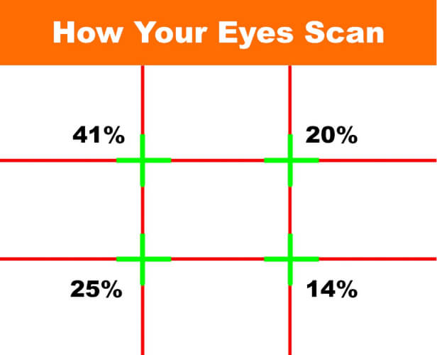
The focal points, also known as the sweet spots, are the four points where the vertical and horizontal lines converge. The user’s focus is inevitably directed to the primary elements when they are given priority and positioned on these attractive areas.
The design is dynamic and interactive thanks to the asymmetry, which also makes it more aesthetically beautiful. It directs the user’s attention to the pronounced details that designers want to make clear. Asymmetrical UI/UX design layouts can naturally direct users’ attention to any desired location.
The central placement of the design element is pretty lovely. But it seems to be dead and stagnant, and these kinds of designs don’t naturally engage with the users.
In UI UX design, why is the rule of thirds crucial?
In UI UX design, the rule of thirds is used to place significant items in the four main areas, which creates visual interest. It boosts user engagement and enhances the likelihood that they will take action.
This helps to keep the user’s attention entirely on what important. By resulting in a harmonious and coherent design, the rule of thirds improves visual equilibrium. The primary goal of UI UX designs is to visually communicate with the user.
The rule of thirds can therefore be thought of as a magical rule that helps designers to position important things in the common paths where users’ eyes will travel. Designers can easily persuade users to take a particular action by implementing the rule.
In a word, we may say that the rule of thirds delivers the UI UX design:
- Visual consistency
- Visual hierarchy
- A rhythm of repeatable patterns
Also Read: The Most Important Factors to Designing a UI-UX
How is web UI UX design use the rule of thirds?
With the aid of the rule of thirds, composition is left to logic. Making a design comprehensible and visually appealing is possible with this effective design tool.
Consider using the rule of thirds in your website design by following these guidelines:
Step 1: Make use of grids in the design
The first step in incorporating the rule of thirds into a design is to create grids. This will result in the same three columns and rows as the preceding image. Once the grid is complete, the four intersections known as the focal points or sweet points can be found.
Step 2: Selecting the focal point will help you create a visual hierarchy.
The next step is to decide which points will serve as the design’s focal points as each element is positioned from most crucial to next. A natural separation between the elements is provided by the focal points. In order to seamlessly navigate users through the prioritized design elements, a visual hierarchy might be established.
Step 3: Prioritize the main element
This is a decision-making stage when the primary component must be ranked according to the design’s focal point. If the site logo is to be prominently displayed in the design, it must be positioned in the top left corner of the grid.
Step 4: Using visual divider lines, organize the design pieces.
The visual divider and rule of thirds grids both visually arrange design elements. Content is divided into several groups or sections by this method. User definition of the content’s relationships is made simpler as a result. In order to make visual containers appear interactive, dividers play a significant part in usability.
Step 5: Create visual contrast
To provide the composition interesting variety, the grid can be used to apply visual contrast. The user is drawn to the most crucial information due to the uniqueness.
Summary
It’s intriguing to learn that nine blocks are all it takes to grab a user’s attention. Design professionals have long used the rule of thirds. Designers have been able to convey important information to consumers by using this psychological strategy, which has been tried and true.
Author
Jayesh Patel
Jayesh Patel is a Professional Web Developer & Designer and the Founder of InCreativeWeb.
As a highly Creative Web/Graphic/UI Designer - Front End / PHP / WordPress / Shopify Developer, with 14+ years of experience, he also provide complete solution from SEO to Digital Marketing. The passion he has for his work, his dedication, and ability to make quick, decisive decisions set him apart from the rest.
His first priority is to create a website with Complete SEO + Speed Up + WordPress Security Code of standards.