Colors in UI UX design set the mood and provoke strong emotions from users. This demonstrates how important color theory is to the design and how they affect visual communication.
Understanding how colors are formed and interact with one another is necessary to selecting the appropriate colors for UI/UX designs.
What is the theory of color?
Designers utilize color theory as a collection of rules and principles to produce visually appealing user interfaces. In order to capture a user’s attention and imagination, visually appealing colors that have an aesthetic and psychological impact on them are crucial.
Color is the primary language used by UI designers for the initial communication since users connect visually with products for the first time. To create harmonious, meaningful designs for consumers, a thorough understanding of color theory is necessary.
It is the skill of blending colors using the color wheel, choosing the ideal hues that best convey the intended message to create aesthetically pleasing user interfaces. Also, each of these hues could imply different things. The framework of color theory provides designers with information about how to employ color in their work.
Understanding colors
The human eye can distinguish more than 10 million different hues, and it is easy for us to detect harmony and contrast in the natural world. Discovering the color wheel provided the fundamental information for this.
The color palettes and various color combinations for each design that would perform best for the target users are thoroughly researched by designers before being used in UI UX designs.
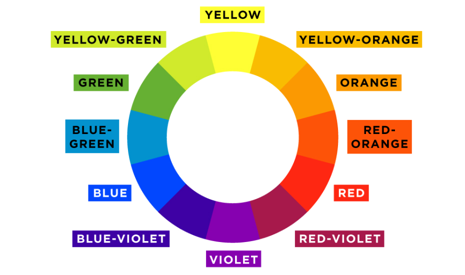
The physics of color theory and Newton’s color wheel
The color wheel has undergone numerous changes over time, greatly expanding the potential for new color combinations. Isaac Newton’s 1666 color wheel is the foundation of contemporary color theory. When precisely combining colors and comprehending how they relate to one another, the color wheel is used.
Primary, secondary, and tertiary colors are the three fundamental types of colors in a color wheel.
- All other colors cannot be combined to become primary colors, which are parent colors. The predominant hues are red, blue, and yellow.
- Orange, purple, and green are the three secondary colors that are produced when primary colors are blended.
- Tertiary colors are produced by fusing two primary colors together. Magenta, vermilion, violet, teal, amber, and chartreuse are considered the tertiary hues.
Colors are blended using the RGB (Red, Green, Blue) color paradigm. Web primary colors are given a value between 0 and 255, with 255 being bright and 0 being dark.
The hues in the RGB color space are additive, meaning that when they are combined, they grow lighter. White results, for instance, from the combination of Red, Green, and Blue.
Color Harmony
Systematically placing colors will help you make a UI that is visually appealing and balanced. This has to be carried out in keeping with the aesthetics and brand image as a whole.
In UI designs, color harmony is crucial for a number of reasons:
- Aesthetics: A well-balanced color composition makes the user interface (UI) more appealing and interesting.
- Branding: Making sure that the colors used in the user interface (UI) are in harmony with the brand’s message is a task for designers.
- Usability: Intuitiveness and user-friendliness are improved in the design.
- Emotion: To improve the user experience, designers can set a certain mood with the aid of a well-balanced composition.
- Accessibility: The accessibility of designs is improved by the use of color harmony to create the appropriate contrast.
The role of color in UX design
It serves as the main platform for designs to interact with users and leave an enduring impact. For instance, McDonald’s uses the hues red and yellow in its emblem to conjure up feelings of elation and exhilaration.
Colors in design can mean a variety of things, like as
- Emotion: People’s emotions are affected differently by various colors.
- Branding: The brand message of businesses is communicated with a particular color.
- Functionality: A product’s utilitarian qualities can also be emphasized via color.
- Cultural significance: Colors have varying cultural connotations.
- Aesthetics: Colors might also be utilized only for decorative purposes.
- Hierarchy: Colors can be used to denote hierarchy or importance.
Also Read : What is the rule of thirds how is it used in UI UX design
How can color be used in UI design effectively?
A well-thought-out color scheme can take a design from “excellent” to “amazing,” yet a mediocre palette could make using it more frustrating for the user.
1. Color’s enchanted power
The thing that usually leaves you with the very first impression is the visual appearance, which is heavily influenced by color.
- Display a brand’s personality: Color can define a brand’s or a product’s fundamental tone, mood, meaning, and conceptualization.
- Improving user experience: It can significantly improve usability by boosting navigation, call-to-actions, intuitive interactions, satisfying aesthetic needs, and providing visual solutions.
- Impact the decision to buy: The primary element affecting consumers’ decisions to buy is, according to Kissmetrics, a product’s visual appeal.
2. Basic ideas regarding colors
Over the course of human history, each color has developed its own own meaning and connotation. Please check here to read the meaning of each language.
3. Methods for effectively using color
- Use the appropriate color in the correct format – Various hues express various emotions and meanings. Unless you want to take a great risk to be different.
- Take attention to BLUE – Blue is a common example of a color used in user interface design since it is unquestionably a safe hue that can win over users’ trust and be accepted.
- Differences in background and element colors – The other components consist of darker and brighter color variations, with blue serving as the theme color.
Color Psychology
The user’s perception can be significantly impacted by the colors utilized. Due to this, UI/UX designers select colors that complement the guiding principles and goals of the brand. Colors can be utilized to conjure up particular feelings and perceptions, and they can also affect how customers engage with a product.
Examples of the use of color psychology in logo design
Colors are carefully chosen by brands to support their identity and effectively convey their messages to consumers.
- Google – One of its key tools is Google’s main offering, Search. Red, yellow, green, and blue are the hues that Google’s logo features.
- YouTube – YouTube, the top video-sharing website in the world, has a logo that mostly uses the colors red and white.
- Amazon – A smiling orange arc between the letters A and Z of “Amazon,” the name of the e-commerce behemoth, makes for an intriguing logo.
- McDonald – The design of the McDonald’s logo is a prime illustration of how color psychology is applied to affect people’ emotions. The red background and golden yellowish arch make use of mood-lifting hues to stimulate appetite.
Summary
The use of color theory in UI UX designs is essential since it has a significant impact on how users view products and websites. Design elements that not only look amazing but also convey the brand message can be produced by thoughtfully and intentionally applying the principles of color theory.
Author
Jayesh Patel
Jayesh Patel is a Professional Web Developer & Designer and the Founder of InCreativeWeb.
As a highly Creative Web/Graphic/UI Designer - Front End / PHP / WordPress / Shopify Developer, with 14+ years of experience, he also provide complete solution from SEO to Digital Marketing. The passion he has for his work, his dedication, and ability to make quick, decisive decisions set him apart from the rest.
His first priority is to create a website with Complete SEO + Speed Up + WordPress Security Code of standards.