There isn’t a dedicated CSS property that accomplishes this, therefore every blog post you see about it is just a collection of CSS hacks that attempt to simulate a gradient.
Non-transparent solution
The most common scenario is when you need to add a gradient shadow to an element that has a background. There are no problems with transparency to take into account.
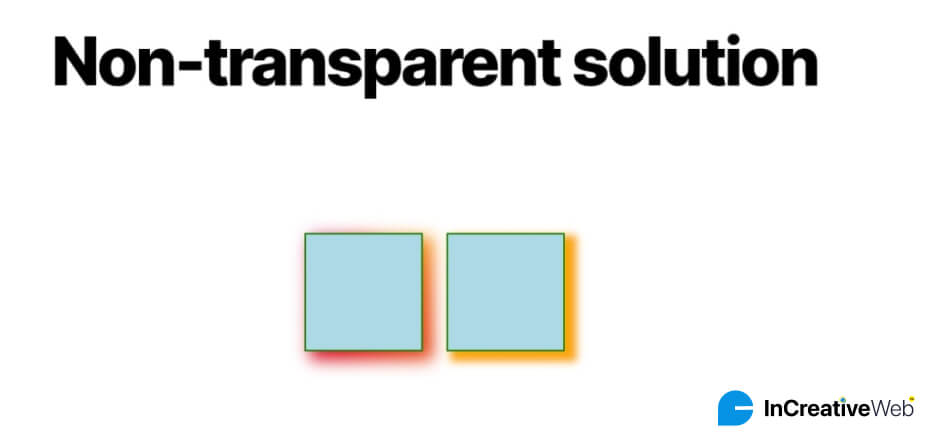
The answer is to rely on a pseudo-element that has the gradient defined in it. You position it beneath the actual component and give it a blur effect.
.box {
    position: relative;
}
.box::before {
    content: "";
    position: absolute;
    inset: -5px;
    transform: translate(10px, 8px);
    z-index: -1; /* place the element behind */
    background: /* your gradient here */;
    filter: blur(10px); /* control the blur */
}
It appears to be a lot of code, and that is exactly what it is. If we had chosen to use a solid color rather than a gradient, this is how we could have accomplished it.
box-shadow: 10px 8px 10px 5px orange;
That ought to help you understand what the values in the first excerpt are doing. We have the spread distance, the blur radius, and the X and Y offsets. Keep in mind that the spread distance, which results from the inset attribute, must have a negative value.
If you pay close attention, you will see that the blur in each shadows is a little different. Being that the algorithm for the filter property is distinct from the one for box-shadow, it is not surprising. Given that the outcome is essentially the same, it is not a big concern.
The z-index still has a few issues with this method, despite its good nature: declared to be one.
The element is no longer underneath the shadow. It is not a bug; rather, it is the logical outcome of a stacking context.
We’ll still demonstrate to you how to get around it. Utilizing a 3D transform is our first suggested remedy:
.box {
    position: relative;
    transform-style: preserve-3d;
}
.box::before {
    content: "";
    position: absolute;
    inset: -5px;
    transform: translate3d(10px, 8px, -1px);
    background: /* .. */;
    filter: blur(10px);
}
We’ll utilize a negative translation along the Z-axis rather of the notation z-index: -1. All of our code will be contained in translate3d(). The main element must have transform-style: preserve-3d applied to it in order for the 3D transform to work.
The third option is to rely on two pseudo-elements, namely::before and::after, if you are unable to apply a 3D transform for some reason. The other replicates the main background (as well as any other styles you might require), while the first creates the gradient shadow. This gives us simple control over the stacking order of both pseudo-elements.
The third option is to rely on two pseudo-elements, namely::before and::after, if you are unable to apply a 3D transform for some reason. The other replicates the main background (as well as any other styles you might require), while the first creates the gradient shadow. This gives us simple control over the stacking order of both pseudo-elements.
.box {
  position: relative;
  z-index: 0;
}
/* Creates the shadow */
.box::before {
  content: "";
  position: absolute;
  z-index: -2;
  inset: -5px;
  transform: translate(10px, 8px);
  background: /* .. */;
  filter: blur(10px);
}
/* Reproduces the main element styles */
.box::after {
  content: """;
  position: absolute;
  z-index: -1;
  inset: 0;
  background: inherit;
  border: inherit;
  box-shadow: inherit;
}
It’s crucial to keep in mind that when we declare z-index: 0 or any other property that does the same thing on the main element, we are forcing it to establish a stacking context.
Remember that pseudo-elements use the padding box of the main element as a reference as well. As a result, while specifying the styles for the pseudo-elements, you must consider whether the primary element has a border. You’ll see that the border specified on the main element is taken into account by using inset: -2px on::after.
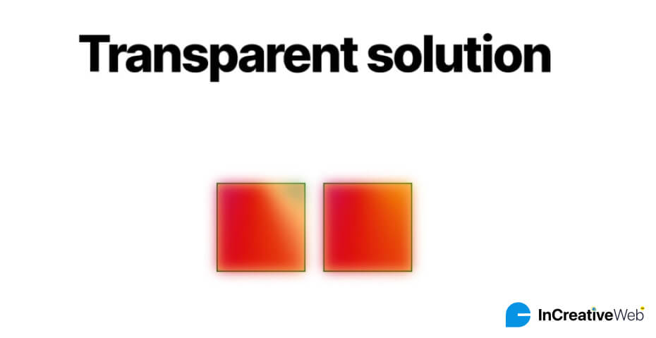
Transparent solution
Let’s resume our 3D transform at the point where we left off and take away the background from the main element. We will begin with a shadow that has a spread distance and offsets of 0.
The goal is to discover a technique to cut or conceal everything inside the element’s area (inside the green line), while leaving the outside intact. Clip-path will be utilized in this situation. You could, however, be perplexed as to how clip-path is able to cut inside an element.
Although there isn’t a way to do that in reality, we can simulate it by utilizing a specific polygon pattern:
clip-path: polygon(-100vmax -100vmax,100vmax -100vmax,100vmax 100vmax,-100vmax 100vmax,-100vmax -100vmax,0 0,0 100%,100% 100%,100% 0,0 0)
We have defined four locations with a large value (B), as you can see. Though you can choose any other big value, 100vmax is the big amount I use. Make sure there is adequate room for the shadow by doing this. The corners of the pseudo-element are also formed by four points.
The polygon’s boundary is shown by the arrows. From (-B, -B), we move forward till (0,0). We require a total of 10 points. Not eight points because the path has two spots that are repeated twice ((-B,-B) and (0,0)).
The clip-path now cuts more than is necessary because the pseudo-element has surpassed the size of the primary element. Always remember to trim the portion that is inside the primary element—in our example, that would be the region inside the green border. Four spots inside the clip-path need to be moved around.
.box {
    --s: 10px; /* the spread  */
    position: relative;
}
.box::before {
    inset: calc(-1 * var(--s));
    clip-path: polygon(
        -100vmax -100vmax,
        100vmax -100vmax,
        100vmax 100vmax,
        -100vmax 100vmax,
        -100vmax -100vmax,
        calc(0px  + var(--s)) calc(0px  + var(--s)),
        calc(0px  + var(--s)) calc(100% - var(--s)),
        calc(100% - var(--s)) calc(100% - var(--s)),
        calc(100% - var(--s)) calc(0px  + var(--s)),
        calc(0px  + var(--s)) calc(0px  + var(--s))
    );
}
In addition to updating the polygon points, we’ve established a CSS variable called –s for the spread distance.
Using offsets follows the same logic. The shadow becomes misaligned when we translate the pseudo-element, necessitating a second polygonal correction and a point-moving in the opposite direction.
.box {
    --s: 10px; /* the spread */
    --x: 10px; /* X offset */
    --y: 8px;  /* Y offset */
    position: relative;
}
.box::before {
    inset: calc(-1 * var(--s));
    transform: translate3d(var(--x), var(--y), -1px);
    clip-path: polygon(
        -100vmax -100vmax,
        100vmax -100vmax,
        100vmax 100vmax,
        -100vmax 100vmax,
        -100vmax -100vmax,
        calc(0px  + var(--s) - var(--x)) calc(0px  + var(--s) - var(--y)),
        calc(0px  + var(--s) - var(--x)) calc(100% - var(--s) - var(--y)),
        calc(100% - var(--s) - var(--x)) calc(100% - var(--s) - var(--y)),
        calc(100% - var(--s) - var(--x)) calc(0px  + var(--s) - var(--y)),
        calc(0px  + var(--s) - var(--x)) calc(0px  + var(--s) - var(--y))
    );
}
The offsets also have two additional variables: –x and –y. In addition to using them during the transform, we additionally update the clip-path values. The polygon points with large values are still left untouched, but all other polygon points are offset instead. To do this, we subtract –x from the X coordinates and –y from the Y coordinates.
Adding a border radius
The non-transparent alternative we started with makes it quite simple to add border-radius to the element. You can finish the process by simply inheriting the same value from the main element.
With the non-transparent approach we started with, it is a rather simple process to add border-radius to the element. Inheriting the same value from the main element is all that is required for completion.
Defining border-radius: inherit is a smart move even if you don’t have a border radius. Any boundary radius you might want to add later or a border radius that originates from anywhere else is taken into account by this.
When utilizing the transparent solution, the situation is different. Unfortunately, since curvatures cannot be handled by clip-path, finding an other approach is necessary. We won’t be able to cut the region inside the primary element as a result.
We will add the mask attribute to the equation. For the sake of simpler code, add an additional element.
To prevent any potential incompatibility with outside CSS, we are employing a custom element called <sh>. We could have used a <div>, but since it’s a widely used element, it may easily be broken by a different CSS rule coming from someplace else.
Positioning the <sh> element and intentionally causing an overflow is the first step.
.box {
  --r: 50px;
  position: relative;
  border-radius: var(--r);
}
.box sh {
  position: absolute;
  inset: -150px;
  border: 150px solid #0000;
  border-radius: calc(150px + var(--r));
}
We’ll explain the logic behind the code as we go, even though it may initially seem a little weird. A pseudo-element of <sh> is then used to construct the gradient shadow.
.box {
    --r: 50px;
    position: relative;
    border-radius: var(--r);
    transform-style: preserve-3d;
}
.box sh {
    position: absolute;
    inset: -150px;
    border: 150px solid #0000;
    border-radius: calc(150px + var(--r));
    transform: translateZ(-1px)
}
.box sh::before {
    content: "";
    position: absolute;
    inset: -5px;
    border-radius: var(--r);
    background: /* Your gradient */;
    filter: blur(10px);
    transform: translate(10px,8px);
}
It should be noted that the black edge defines the <sh> element’s area.
The fact that the additional element is fixed and only the pseudo-element is moving (by means of translate) is another advantageous aspect of its utilization. The final part of this trick will be made much easier for me thanks to this.
mask:
  linear-gradient(#000 0 0) content-box,
  linear-gradient(#000 0 0);
mask-composite: exclude;
That’s it! We have a gradient shadow that works with border-radius! Your expectations were presumably for a complicated mask value with a ton of gradients, but no! The magic can be finished with just two straightforward gradients and a mask composite.
To understand what is occurring in the <sh> element, let’s isolate it:
.box sh {
  position: absolute;
  inset: -150px;
  border: 150px solid red;
  background: lightblue;
  border-radius: calc(150px + var(--r));
}
The first problem you can run into has to do with the use of a border on the primary element. If you neglect to take this into consideration, the radii may become slightly out of alignment. In our example, this problem exists, but you might not even notice it.
Add the width of the border for the inset of the <sh> element to make the problem go away.
.box {
  --r: 50px;
  border-radius: var(--r);
  border: 2px solid;
}
.box sh {
  position: absolute;
  inset: -152px; /* 150px + 2px */
  border: 150px solid #0000;
  border-radius: calc(150px + var(--r));
}
Another disadvantage is the large border size (150px in the example) that we’re employing. In order to prevent overflow and scrollbar concerns, this value should be large enough to accommodate the shadow without being too large.
Conclusion
Gradient shadows’ mysterious magic is no longer a mystery. We made an effort to cover all the bases and any potential problems you might encounter. Playing with CSS clipping and masking gave us some terrific exercise. Gradient shadows are one of several CSS features that InCreativeWeb is skilled at using to provide complete solutions for all design requirements. Our expertise in CSS masking and clipping methods is a useful asset for producing original and perfect web designs.
Author
Jayesh Patel
Jayesh Patel is a Professional Web Developer & Designer and the Founder of InCreativeWeb.
As a highly Creative Web/Graphic/UI Designer - Front End / PHP / WordPress / Shopify Developer, with 14+ years of experience, he also provide complete solution from SEO to Digital Marketing. The passion he has for his work, his dedication, and ability to make quick, decisive decisions set him apart from the rest.
His first priority is to create a website with Complete SEO + Speed Up + WordPress Security Code of standards.